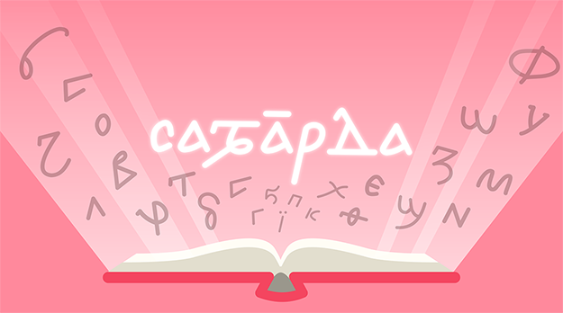
Sawarda Nubian
Sawarda Nubian is a Nubian typeface designed by Hatim-Arbaab Eujayl. Sawarda is currently available as public alpha in Regular and Semibold, in OTF, TTF, and WOFF formats. Any feedback on the font, as well as feature requests are welcomed via the A.NUBI.S Discord server.
- SawardaNubianAlphaRegular.otf
- SawardaNubianAlphaRegular.ttf
- SawardaNubianAlphaRegular.woff
- SawardaNubianAlphaSemibold.otf
- SawardaNubianAlphaSemibold.ttf
- SawardaNubianAlphaSemibold.woff
Copyright ©2021, Hatim-Arbaab Eujayl. This Font Software is licensed under the SIL Open Font License, Version 1.1.
Release Notes
The first version of Sawarda Nubian has now been made available to the public, making it — at least to my knowledge — the first publicly available Nubian typeface that is explicitly and visibly based on Old Nubian manuscripts. However, with any luck, it won’t be the last, and for that reason I thought it would be a good idea to talk about the process of designing Sawarda Nubian: the principles followed, the reasoning behind certain design decisions, and suggestions for future Nubian type designers.
Personal Background
A quick note on my personal background: I’m not a professional type designer. In fact, I’m not a professional anything: I’m a college student who is passionate about Sudanese history and linguistics in general, and Nubian history and linguistics more specifically. In addition to that, I’m not a Nubian-language speaker: I belong to an Arabized branch of the Nubian Mahas tribe that probably hasn’t spoken Nobiin for over a century. In short, I’m an amateur in multiple senses, however I’d still like to think I’ve provided a basis upon which those more technically and linguistically suited to this task can build.
In my ideal Nubian type design future, the people making Nubian typefaces will be the inheritors of Old Nubian culture in general (which, to some extent, includes me) and speakers of Nubian languages specifically. Simply put, Nubians should be at the forefront of Nubian type design and this, I think, is going to be a key part of the Nubian literacy revival that is currently underway.
Design Context
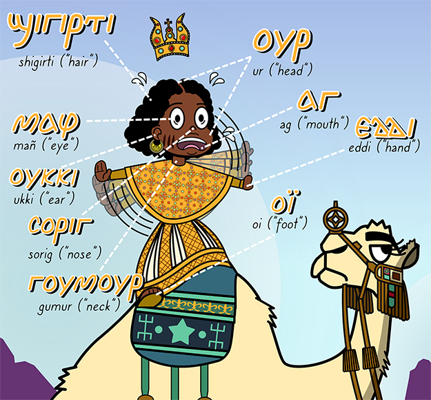
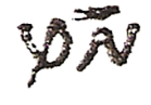
Sawarda Nubian emerged when I was making a graphic displaying the words for the different parts of the body in Nobiin. There was a need for an aesthetically pleasing Nubian typeface, and since none were available, I made a typeface, drawing the glyphs I needed and manually arranging them in illustration software:
Every other Nubian font available (the most common being Sophia Nubian and Antinoou) is not based on the script found in Old Nubian manuscripts, but Coptic, which, since the revival of Old Nubian studies in the 1980s and ‘90s, has been the basis of how people write and type Nubian. Initially Sawarda was designed with the sole intention of being used alongside art: however, it has evolved to support all the diacritics and brackets needed for the scholarly community, and through tests with Old Nubian scholar Vincent W.J. van Gerven Oei, it has shown itself largely capable of rendering scholarly texts. However, it is still not designed to match any specific Latin or Arabic typefaces, and these scripts that are used frequently alongside Nubian writing on the web, in scholarly writing, or in books published by Nubian authors.
Design Principles: What Makes a Nubian Typeface Nubian?
From the very beginning the “Towards a New Typeface for Nubian Languages” lecture by Vincent, whose contributions have been essential to the development of Sawarda, has been foundational to its design philosophy. From this lecture, as well as my correspondence with him, the design principles of Sawarda emerged, principles that I would argue make a Nubian typeface Nubian. These principles can be summarized in one sentence: the Nubian script is unique. More specifically, the Nubian script is not simply a variant of the Greek and Coptic writing systems, it is its own script with unique aesthetic qualities that I believe are an integral part of designing an authentic Nubian typeface. These are:
-
The lack of capitalization: There is no capitalization in Old Nubian manuscripts. This occasionally crops up in modern Coptic-based Nubian writing but it’s not a part of the Nubian writing tradition. Furthermore, capitalization conventions, at least from my experience, are observed by a minority of Nubian writers.
-
The slant: This is perhaps the most iconic feature of the Old Nubian script. However, it is not the only important feature, and I truly believe an overfixation on it leads to or will lead to the misconception that Nubian is simply slanted Greek-Coptic with a few extra letters. This isn’t true: we have Old Nubian texts with a modest or nonexistent slant (like The Miracle of Saint Mina manuscript) which are still recognizably Nubian owing to other features which I would argue are even more essential to Nubian typeface design. That said, the slant should be kept in mind (more on this later).
-
Letter proportions: Old Nubian has two classes of ascenders (low and high) and descenders (shallow and deep), and, in its authentic form, its deep descenders descend much deeper than Latin, Coptic, and Greek letters, while its high ascenders reach much higher. The matter of which letters are shallow or deep descenders, or low or high ascenders, is largely consistent in Old Nubian manuscripts and should be kept in mind during typeface design.
-
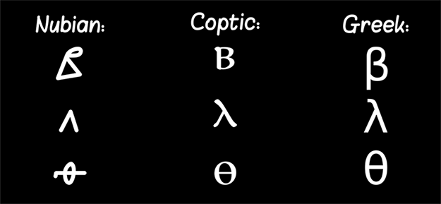
Letterform: This, I would argue, is the most important feature of authentic Old Nubian typeface design: there are letters in Old Nubian whose ductus differs from their Greek and Coptic counterparts (see below). What I think makes the current Nubian typefaces, particularly Sophia Nubian, so distant from Old Nubian aesthetically is the fact that they use Coptic, Greek, and occasionally Latin writing and type design traditions as a model for letterforms: not a Nubian writing tradition. It is absolutely crucial to recognize that Nubian letters feature visible, fundamental, but also replicable differences from Greek-Coptic letters, and anyone seeking to build on the Old Nubian manuscript tradition should take these manuscripts as a model. This is especially important regarding the Nubian characters derived from the Meroitic alphasyllabry, whose forms in the Coptic-based Nubian typefaces are near-unrecognizable distortions of their Old Nubian originals.
That said, it is impossible to deny that the uncontested dominance of Coptic-based typefaces in the world of Nubiology and language advocacy has played a powerful, perhaps irreversible role in how the Nubian script is perceived by Nubians and non-Nubians alike. Nevertheless, it is my hope that Sawarda Nubian helps publicize the unique Nubian letterform and increases its accessibility. Who knows? Maybe the Nubian type designers of the future will be able to find an aesthetic middle ground between Coptic and Old Nubian in a way that will satisfy both purists and those who have gotten used to the Coptic “look.” In general, I think it is healthy to have multiple calligraphic styles, and I think it’s evidence of a living written culture.
Software
Sawarda Nubian was designed entirely through the use of free and open source software. Inkscape was used to design the glyphs, and FontForge was used to convert these glyphs into a typeface. This should go to show that type design doesn’t need to be prohibitively expensive: both programs are capable of creating fully-fledged typefaces, and designers low on money should not shy away.
References
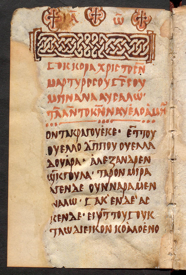
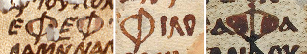
From its very inception Sawarda Nubian has drawn its letter forms from this manuscript from Qasr Ibrim:
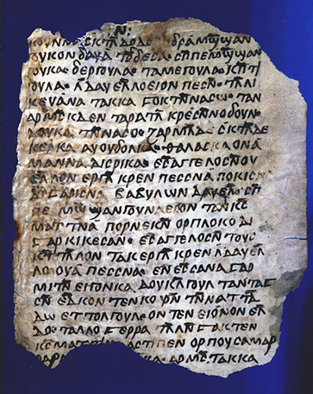
This represents what I think is one of the clearest and most accessible examples of what I would call “standard Nubian” ductus: basically, it’s Nubian Calibri and it’s perfect for designers who need a basic idea of what each letter is supposed to look like. That said, the manuscript doesn’t contain the full character set, and it’s also not the easiest to deduce the ductus of each individual letter from this manuscript. As a result, I highly recommend referencing the Miracle of Saint Mina manuscript as well, since it’s written in a style which makes stroke order and direction clearly apparent:
Or you can refer to the tutorial on Nubian writing I made on Twitter. In the end, knowing how each letter was written was key to reproducing Old Nubian letterform, which is the most important part of making a Nubian typeface look Nubian.
Typeface Properties
The Slant
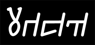
Sawarda Nubian, like the majority of Old Nubian manuscripts, is slanted. The iconic Old Nubian slant is about 20 degrees. How much is Sawarda’s? Couldn’t tell you: rather than design the letters in an upright fashion and slant them afterwards, they were designed slanted from the start.
I’m not quite sure I recommend this approach: on one hand, I think it helped make Sawarda look “naturally” slanted, for lack of a better word, rather than an oblique typeface. On the other hand, it created some slant-consistency issues which I’ve been able to overcome but may not be worth the headache for others. In any case, I want to reiterate that while this is an iconic feature of the Old Nubian aesthetic, it is not the most important feature: the Miracle of Saint Mina manuscript is a great example of a visibly Nubian text with no slant.
A note on shai and omega: Omega and its sibling, shai, have a tendency to slant a bit to the left in contrast to every other letter which slants right. I’ve elected to keep this baffling aesthetic decision that my ancestors made but future designers may consider unifying the slant and bringing an end to omega and shai’s 1000+ year rebellion.
Hooks
In Old Nubian, there are two types of hooks which appear on letters: small hooks which are written as a part of the stroke and big hooks, where the hook is a stroke on its own:
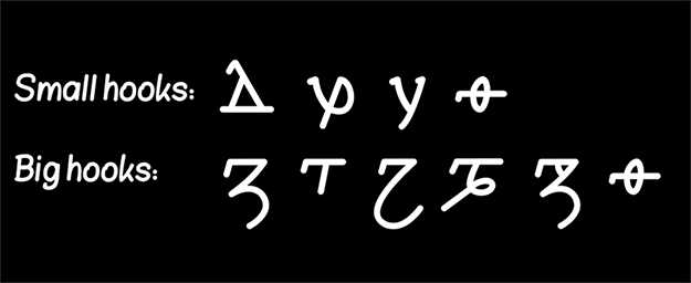
The distinction is important to recognize, since, while the big hooks appear to be a key component of a letter’s aesthetic, in many manuscripts, small hooks appear almost nonexistent. I considered removing them as Sawarda’s look is generally “modern” — perhaps this is an analogue to serif vs. sans-serif typefaces in Latin. I think this is a design decision that should be consciously thought through by designers, as hooks abound in Old Nubian glyphs and appear to have been considered a key part of each letter (well, more so big hooks than small hooks).
Proportions
Old Nubian has two classes of ascenders (low and high) and descenders (shallow and deep), but, as stated earlier, more important than that is the fact that Old Nubian high ascenders go really high and its deep descenders go really low. Additionally, many of these ascenders and descenders are curvy and quite extravagant. In short, they play a key role in establishing the silhouette of Old Nubian. A line of Coptic (especially the Coptic-based typefaces) is boxy and orderly, but a proper line of Old Nubian tends to be flowy and eccentric:
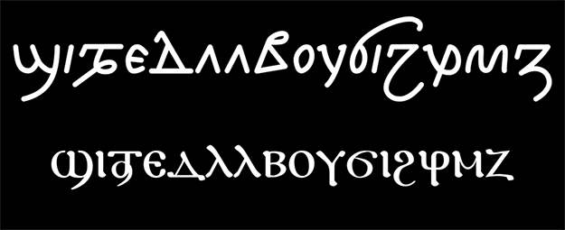
Part of what makes the Coptic-based typefaces so un-Nubian is this boxy silhouette, meaning that preserving Nubian’s large ascenders and descenders goes a long way in making a typeface look Nubian.
That said, Sawarda Nubian does deviate from Old Nubian precedent in ascenders and descenders in a few ways. Firstly, beta is represented as a low ascender, which has precedent in manuscripts but is rare; phi has a shallow rather than deep descender; shai is a deep rather than shallow descender; psi doesn’t ascend at all. There is precedent for all these things, but due to aesthetic preference I ended up using more unusual examples of each letter as a model.
I don’t think this makes these letters unrecognizable, which shows there is some flexibility, but ultimately, I would argue that the large ascenders and descenders are a key part of the Old Nubian aesthetic.
Control Characters
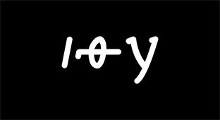
It is my recommendation that designers begin by designing iota, theta, and upsilon, from which you’ll derive most of the components needed to build all the other letters, with iota also helping establish the typeface’s slant.
Considerations about Specific Characters
Beta
Old Nubian manuscripts feature two types of betas, both of which represent a rather significant stylistic departure from the “B” people are familiar with from Latin, Coptic, and Greek.
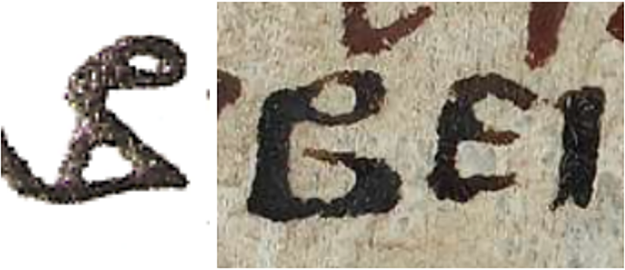
The letter is typically taller than x-height (unusual for B in related scripts) and is overall very distinct. There’s a good amount of space in between the two loops, the bottom loop tends to be triangular in most manuscripts — overall, it’s just very different. Of the two styles — the second of which is far more in line with the B people expect — Sawarda Nubian has chosen the first, a decision that is primarily political (it’s more distinctly Nubian) but also aesthetic.
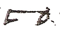
Waw
Of all the Meroitic characters, waw has been the least-abused by Coptic typefaces, at least having the correct ductus. However, its tail points downwards, which, while attested, is rare.
There is clearly room for designer choice here seeing that there was variation in Old Nubian, however Sawarda has chosen the counterclockwise facing tail for waw.
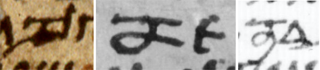
Engma
Engma has been rendered as something not dissimilar to a bracket in Coptic-based typefaces. It is worth noting that engma has historically had a very long horizontal top stroke:
While Sawarda Nubian’s engma is comparatively modest, Nubian type designers of the future hoping to replicate Old Nubian letter form should note this important aesthetic feature.
Nyi
Nyi has been the most abused by the Coptic-based typefaces, being hardly recognizable compared to its Old Nubian form. If you seek to replicate the Old Nubian form, keep this in mind: nyi is basically just an upsilon and a rho combined. It is not a half-phi or a loopy psi, it is supposed to have a lot of white space as a letter.
Phi
The Nubian phi is massive:
While Sawarda’s phi doesn’t go as far down as the classic phi, it attempts to preserve the overwhelming size of the original. This, I would argue, is a key distinguishing feature between an Old Nubian typeface and a typeface based on the Coptic typefaces, which generally have a modest phi.
Diacritics
Sawarda Nubian includes the macron (by far the most important diacritic in Nubian, both Old Nubian and modern Nubian languages). It also has the above dot, diairesis, the below dot, as well as the accent grave and aigu.
The letters with macrons are programmed as ligatures, and are not formed by marks and anchors. This was done initially because I didn’t know how to do marks and anchors at first, but it proved beneficial, as it provided me more control over the length of the macron, which ideally varies with each letter. I’m still not sure I recommend this approach: for all the other diacritics, I used marks and anchors and it’s just less of a headache in the long run.
The accent grave and aigu have no history in the Nubian script: I’ve included them for the possibility that some Nubian writer may want to indicate tone. This is unlikely; it is not uncommon for tonal languages to have scripts which don’t indicate tone, additionally, Nubian languages have very few words distinguished from each other only by tone. That said, it should be possible for a Nubian typeface to reflect the phonology of the language — having a means of marking tone helps that.
Punctuation
I’ve noticed this tends to be a neglected area in non-Latin typeface design (particularly Arabic), but since I plan on using Sawarda Nubian in my upcoming book — a story book — it’s important for me to have punctuation that harmonizes with the script and I recommend that designers do not neglect at least having basic punctuation marks made (like the question mark and the apostrophes).
Sawarda Nubian also features Old Nubian punctuation, both mapped to their proper Unicode points, but also as a stylistic set since the most common Nubian keyboard layouts don’t feature readily accessible Old Nubian punctuation.
Ligatures
Sawarda Nubian revives Old Nubian ligatures, which, up until now, didn’t survive the transition between Old Nubian writing and the revival of the script in Coptic form in the 1990s. They’re available as discretionary ligatures, since it’s unlikely most users will want to use them: there is an issue that omikron-upsilon, a common digraph, has a ligature that is a part of this set. The reason this is an issue is because the omikron-upsilon ligature is 1) rare in Old Nubian manuscripts, and is not used as consistently as gamma-iota, for instance 2) is simply an obnoxious letter. In the future I will try to find a way to separate the rabbit letter from the other, more commonly used and aesthetically pleasing ligatures.
More important than the Old Nubian ligatures, however, is creating (or considering creating) ligatures for pairs of the flag letters jima and chima. While the overlapping flags look rather nice for chima, on jima a ligature works wonders in making the typeface look elegant. Sawarda Nubian also includes a ligature for the double delta, merging them at the base. Delta generally has a lot of white space, so combining the bottom stroke of both deltas rather than kerning them farther apart is a good way to prevent words from looking too spacey, in my opinion.
The Future of Sawarda and Nubian Typeface Design
Sawarda is, of course, not complete. There are technical issues that need to be addressed. Sawarda also shunned one of the design principles laid out in Vincent’s lecture on Nubian type design: harmonization. In the Faras lecture, Vincent advocated for the creation of a Nubian typeface with English and Arabic companions, seeing as Nubian is probably used more frequently in bilingual contexts (particularly with Arabic) than monolingual ones: while this is a good point and an interesting design challenge, it’s one that I’m not currently planning on taking. It is, however, one for future designers to keep in mind, particularly with Arabic as Arabic-Nubian bilingual text is likely the most common usage of the Nubian script we see online.
There is another script that is important to both Nubian heritage and Nubian studies, and that is the Meroitic script, which will likely be of increasing importance as Meroitic is slowly better understood, enabling more and more research into the language and more scholars who are going to write in it. Sawarda currently includes draft versions of the Meroitic glyphs, although the kerning on them has not been tested. The subject of Meroitic typeface design raises its own challenges that would require a whole other article to address, including but not limited to how to distinguish the Meroitic h, m, and s, for which a number of approaches are possible.
Sawarda should serve as an example of what is possible in terms of Nubian typeface design: it is an Old Nubian manuscript-based typeface that is free and openly licensed, made on free and open source software. It also goes to show that the Old Nubian letterform need not just be a thing of the past: there is a place for it in the 21st century, and more Old Nubian-style typefaces can be made by amateurs without a high price tag. Sawarda (hopefully) provides groundwork for Nubian type designers to build upon, where they can find a way to blend tradition and the modern world.